I'm A Product Guy.

Good, bad, great, all products can be better.

If you’re like me, you slightly obsess over every product you come across and are either impressed and inspired by an amazing experience or deeply disappointed by a total miss.  I can’t keep this ecstasy or misery to myself so there’s usually some rant which follows.

Pep Talk: Apple App Store Reviews

Stars Are Not Enough.

A "Four Star" Review Highlighting Major Issues.

A "Four Star" Review Highlighting Major Issues.

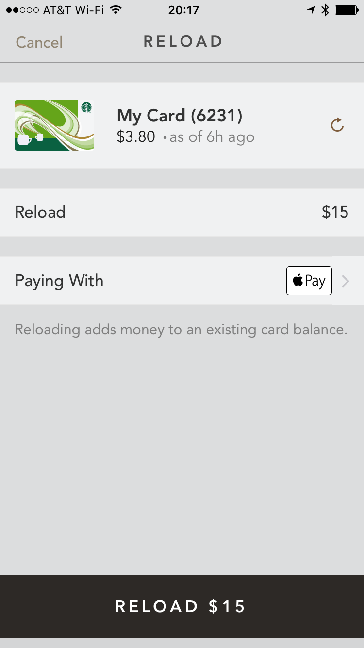
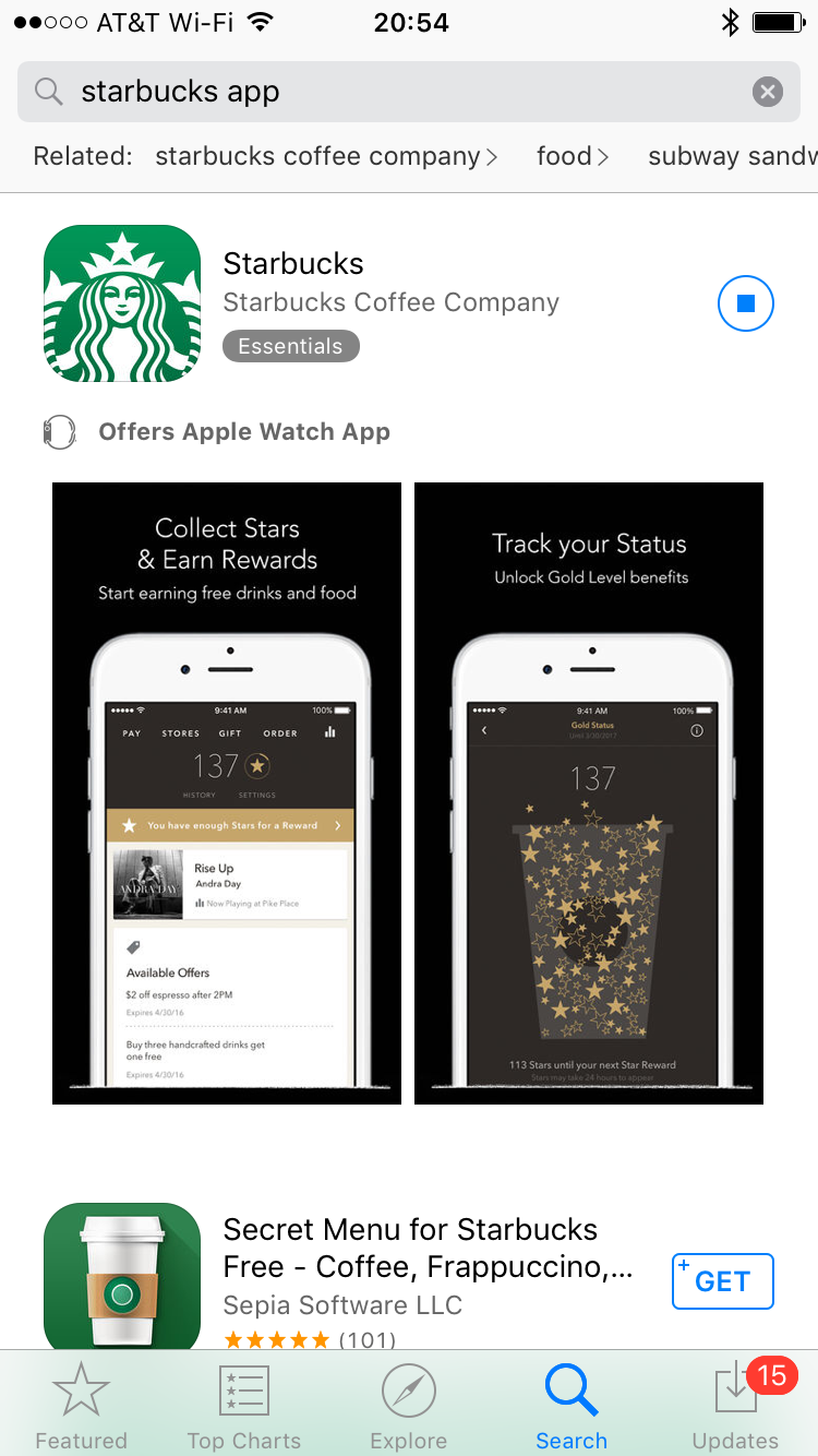
A few words on App Store reviews.  When considering ratings and reviews it’s important to separate feedback for the app UI from the backend service and fulfillment.  Of course these are important for the complete customer experience, but for example negative ratings about some local restaurants not supporting mobile ordering should not cloud judgement of a what may be slick UI for serving up offers.  Case in point, the Starbucks app does a lot of things well but they also have loyal super fans who tend to go easy on their shortcomings.  

Take this iOS review of the Starbucks app, four out of five stars, good right?  Yeah, no.  It's an account of duplicate credit card charges, mobile order failures, and an all around bad customer experience.  These four stars contribute to the 4.5 star rating of the app.  So as product people when evaluating mobile apps don’t be too quick to dismiss low star rated mobile apps as total disasters or the holy grail, assuming all 5 start apps are infallible.  

How can we make this better?  Apple App Store, this is your Product Pep Talk.  The App Store should offer more than a star rating and description, something like what Lyft does to learn more about how their drivers can improve, qualitative categories like: Safety, Navigation, Friendliness, Cleanliness.  As mobile app proliferation continues to grow, review categories like: Performance, Customer Experience, Usability, Features will help users and app developers learn more from the crowd. 

Starbucks Grinds Out Mobile Commerce

With nearly 20 million MAUs, Starbucks brews up success in mobile commerce.

Starbucks boasts over 20 percent of their U.S. transactions run through mobile.  They introed a basic QR code app for mobile payments and loyalty, then added mobile ordering; which, get this,  accounts for 15 percent of those payments (3 percent of total transactions) for Starbucks! (market cap $80, billion), who’s threatening McDonald's (market cap, $98 billion) for the largest restaurant chain in the world.  All very impressive for a coffee company, not exactly a tech giant.

What can we learn from “the bux?”  They’ve proven a streamlined mobile experience can increase sales and strengthen customer loyalty where others have faltered, so what’s so special about the their mobile app? and how can it be better?

Let’s dig in for a closer look.  In the name of this blog, I forged through slightly acidic, serviceable coffee, foregoing SF’s slightly over the top coffee culture (hit me up in comments for a list of my favorites).

THE GOOD

Overall, the app's great.  Admittedly, we’ll mostly focus on its awesomeness and nitpick about enhancements - but hey, that’s what we do here.  If you haven’t already, download the Starbucks app or check out this blogwhich gives a good account of the customer experience.  So what's the big deal with the Starbucks mobile app?  its focus on the Must Have user experience: Order/Pay, Loyalty, Newsfeed.  We’ll drill in on each, but first a quick word on Usability.

USABILITY

Not to take anything away from the usability, which is intuitive and clean.  The UI elements are practical and legibility rules over aesthetic, it’s intuitive and just works.  Here are a few highlights:

sbux-nav.png
  • Top Nav, covers discoverability of core use cases:  Pay, Stores, Gift, Order… and Music (um, we’ll get to that in a moment).  With a horizontal set, the first and last are most discoverable as we tend to focus on the edges.

  • Strong Sense Of Home, aside from the Order flow, all other nav options stay within one tap (or slide) away from home.  By keeping users close to home, there’s less chance of getting lost or confused.

  • Slide Up Transitions, help reinforce the strong sense of home.  Pay, Stores, Gift, and Music all slide up from the bottom and at any time can be swiped down returned to home.  This allows the user to bail out of any navigation path, with ease.

This's all great! however, clean UI and Usability are not enough, it’s the Must Haves - Order/Pay, Loyalty, Newsfeed - which drive adoption and usage.

ORDER/PAY

The core purpose of the app is making purchasing easy; both in-store and order ahead for pickup.  We could spend an entire blog on Order and Pay - and we may - but for now, here are highlights:

GG-prev-order.PNG
  • Shake to Pay: Interesting, and no, not in a shake-weighty sort of way; more in a no-taps-to-pay, way. It gives you an out at the point of sweat.  Morning rush, you’re at the register, behind a line 20 deep, instead of hunting for the Pay button, just shake, shake it on.  Faster than pulling a card out of your wallet, your savior from the stinkeye.

  • Order Flow: Actually, Reorder flow, is the real standout. No messing around with saving favorite orders, naming, or bundling items to the order.  Once you order, you’re good to go for your next reorder.  If order items and location are the same, five taps to skip the line, done. 

  • Add Item: Clean list, with Favorite items at the top, search feature above those, and categories below.  This considers all types of shopping use cases: convenient favorites, hunters, and gatherers, respectively.  
  • Map UI: Especially in the Order flow is intuitive with helpful iconography like green dot stores are open, grey are not; launch directions; and locate yourself on the map…  it all just works, with no explanation needed.  The pulsating blue dot is you and the green check mark icon (reinforced from the location selection) is your destination, your order awaits.  It’s like a game: caffeine hunt.  

LOYALTY

Loyalty has a price and Starbucks pays it with rewards.

When merchants take their foot off the pedal with loyalty - offers and rewards - the mobile commerce engine comes to a grinding halt.  Starbucks gets it and the app gets to the heart of the matter, answering how’s my progress towards rewards?  Loyalty is recognition for my patronage and that’s why it’s front and center, perhaps the first UI element to catch the eye.  Points and rewards, keep me coming back, I guess loyalty does have a price.  Loyalty is given the size and space it deserves; displaying progress towards rewards.  Tap for loyalty program details: tier based on earning two stars for every dollar spent, 125 stars earns a freebie.  It’s clear and to the point.

NEWSFEED

How to ensure an app stays fresh? devote 75% of the home screen to a newsfeed: a content delivery pipeline to users.  When I’m not in some task like ordering this is where I go.  This is in-app messaging, clear and simple: featured items with direct links to order; games to earn loyalty points; and even offers.  The content is always changing, which gives users another reason, other than ordering or paying to open the app.

OPPORTUNITY FOR IMPROVEMENT

The app is a hit with both users and critics alike; but it’s not without flaws, products can always be better, here are a few improvements I hope they’re considering.  

  • Two-Tap Pay, should be one-tap pay.  Shake to Pay is awesome, but not everyone will get it or use it.  For the rest, Starbucks should clean up the Pay usability.  Move the QR Code to the initial Pay screen.  It’s not clear why the extra step: the total already shows, so no added balance inquery fee to the bank; and they’re not adding the step for security like fingerprint ID.  Here’s an updated version that removes a tap, now one-tap pay.
  • Music, is the answer to which one of these things is not like the others?  It’s a distraction, takes the coveted end position from the main attraction: Ordering; and users may be better served if it were a separate app, Starbucks Music - similar to what Facebook did with its Messenger app - or just slip it into the sub nav menu.  Another thought is to replace the “stars to reward” message in the green border with, song now playing at nearest store + music icon to open the Music app.  

Starbucks App Home Reimagined.

Starbucks App Home Reimagined.

  • Top Navigation, is slightly cramped, I’ve an iPhone 7 Plus and have more than once selected the wrong link.  I’m nitpicking here, the Top Nav should be bigger, bolder, with more padding between choices.  

I’ll save the rest for when I’m feeling more obsessive, stay tuned.    

THE FUTURE

In the future, core use cases of Order/Pay, Loyalty, and News won’t change, but the techniques and technologies used to engage with customers will.  While Apple Watch, Passbook is a great start, the future will have tighter integration with wearables and location aware engagement.  A not-so-visionary future scenario could use machine learning to know it’s been longer than normal since your last coffee and when you approach a Starbucks your watch simply asks you to confirm your “usual” orders and replies it’s awaiting at the nearest store.    

THE BOTTOM LINE

Back in 2013, CEO Schultzie said it best “No single competency is enabling us to elevate the Starbucks brand more than our global leadership in mobile, digital, and loyalty.”  Their mobile app is where these all come together, it’s a mobile ordering, payment, loyalty engine used to connect with their users.  At its core these Must Have use cases are what grabs and holds users.  The app, stresses function as the aesthetic, the real reason for success is its focus on: Order/Pay, Loyalty, and Newsfeed.  They’re winning here and winning in mobile commerce.  Keep on the lookout for app updates, they happen often, and in the meantime it’s all you need for your caffeine fix, so keep your card in your pants.

Pep Talk: Facetime Video Messages

Welcome to 2017, it’s good to be a product guy, cool tech abounds: autonomous cars; AI layered onto everything from natural language processing to credit scores; wearables track our health; phones are essentially minicomputers to keep us constantly connected (saving us from real human interaction - I’m half kidding).  But honestly we can do better.  As a child I imagined this time to be way more advanced, think Jetsons.  Am I being unreal?  What do you think? let me know in the comments.  As I come off of a short break and move this blog to a quarterly, I’ll add in Productpep Talks: quick hits which cover one specific product and focus focus focus on how it can be better.     

Quick rant, video calling:  When it comes to video calls, we’re way behind.  They existed even before Skype (2003) and over the last 10+ years, not much has changed.  Bandwidth, connectivity, video quality, still frustrate the majority of calls and most just revert back to the voice call.  Over the past year, my team had members in Seattle, Denver and SF we tested Google Hangouts, Skype, Skype for Business (disaster), Join.me and none were as reliable as a voice call and most caused frustration: drops, delayed meetings due to setup, and frustrating lags.  This is one of the most over-solved problems of our time, so why can’t these companies just get it right?  OK, rant over.  While at iceberg pace, this tech will improve and video calling will soon be usable, even preferred, I guess we just have to be patient, meh.

For one-on-one personal video calls, I’ve been using Facetime; quick catch-ups with friends and family - mostly while driving in the car - it works well.  Of course, to play everyone must have newish iPhones but the video and voice quality is fantastic, all is good.  That is until someone is unavailable, then you’re left with this:  

“Call Back,” “Cancel,” “Leave a Message” (iMessage)... that’s all, Come On!  This is a video call, we’re supposed to be futurists leaving the past behind… and BTW, I’m in the car and should not be texting (sure I can use Siri to text, but that’s a separate flow).  So Facetime, this is your Productpep Talk (trademark, 2016 - not really).  

Facetime Video Messages.  

Facetime, you had me at hello.  You’ve been great.  Even Siri, my stylish female British operator, can place calls “Hey Siri, Facetime Tim Cook.”  “Placing a Facetime call to Tim Cook.”  The video is serviceable to good and audio speakerphone clarity is crisp.  My iPhone 7 Plus made calling friends and family fun again.  That is until they’re not available.  Why can’t we keep the fun rolling?  Leave a video voicemail?  Skype can do it (sort of).  Snapchat has made a $20 billion business out of this.  So why can’t we just have a tiny, 20 second, video voice message…. iVideo Message… Video iMessage… Videomail or whatever the Apple marketing genius bar wants to name it.      

Today...

  • I can leave an iMessage for missed Facetime calls
  • I can create a video and attach it to an iMessage (but in a separate flow)

Let’s combine the two and leave a video message, 20 sec limit.  I mean, Snapchat can do this, why can’t you?

Something like this:

Update to leave Facetime, Video Messages.

Update to leave Facetime, Video Messages.

Recipients would find Facetime messages in Phone, Voicemail section, soon to be named something else.

Video Messages display in the same list as Voice Messages.  Option for voice only or full vid.

Video Messages display in the same list as Voice Messages.  Option for voice only or full vid.

Okay, good talk Russ.  Let’s get back in there and bring us the Video iMessage we all want; and don’t leave me hanging.  

good-talk-russ.jpg