I'm A Product Guy.

Good, bad, great, all products can be better.

If you’re like me, you slightly obsess over every product you come across and are either impressed and inspired by an amazing experience or deeply disappointed by a total miss.  I can’t keep this ecstasy or misery to myself so there’s usually some rant which follows.

Filtering by Category: technology

AirBnB: Host With The Most

With nearly 17 million guest stays this summer, AirBnB is creating an industry out of thin air but can it overcome political and social hurdles to continue disrupting the travel industry?  

pic.JPG

Are you an AirBnB host?  I am.  There’s nothing like your first time, the trepidation: which valuables to lock up? will they trash our place? or even worse: will they not love our home? give us low ratings?  

AirBnB, there’s so much to discuss, let’s unpack the product over a few blogs, starting with how AirBnB should address the backlash while refreshing their mobile app for hosts.  

My wife and I decided to give it a try: set up profile; arrange professional photographer; book first stay; check, check, check.  So, remind me again why we’re letting complete strangers have our home for a weekend?  sleep in our beds, wash their naked bodies in our showers, co-habitate our space with our precious little beta fish!  why?  We want to be part of the sharing economy.  We put great care in making our home a stylish, comfortable space and love opening it up to others; oh yeah, and they’re paying us.  

While my AirBnB experience, so far has been good; the mobile app missed my expectations and there’s room for improving it for hosts, like me.

Also, if AirBnB is going to extend their stay atop the industry, they must address political and social concerns: Trust, Safety, and Regulations and it makes sense to do this while sprucing up their mobile app.  For now, let’s focus on Trust and Safety, we’ll get to Regulations later. 

THE GOOD

I like the aesthetic of AirBnb’s mobile app.  It offers a clean design: crisp, intuitive iconography; snappy pics; without excessive lines or superfluous UI elements.  Other standouts:

  • Help Center is well organized and full of useful information
  • Host/Guest toggle for context switching between hosting and traveling, great!
  • Edit Listing is clearly presented with obvious anchors and a handy preview  
  • Groups are easy to find and follow  

OPPORTUNITY FOR IMPROVEMENT

Quick Rant: The AirBnB app should be situationally aware.  What do I mean? 

AirBnB Landing Page, Meh.

AirBnB Landing Page, Meh.

Without reservation requests, the landing page, the entryway into the app is a bland, colorless, dull message screen: “No Reservation Requests.”  This from a team that prides itself on design?  it’s the oatmeal of landing pages.  

Also, my wife and I share Google Calendar, Google Drive,  iTunes Library, bank accounts, Amex Cards, but I have to log into her AirBnB account to help manage our listing.  Be situationally aware.  
Rant over.  

The AirBnB app was pitched as the “Host Home” for managing listings; and since launch the world has changed, hosts need more tools to feel at home. 

Tools to help them address concerns related to: Trust, Safety, Regulations.  

TRUST

Trust is built on verification of reputation; and the AirBnB App must support use cases which build Trust. 

Guest Star Ratings
AirBnB guests should be rated, just like Uber and Lyft passengers.  Guest reviews are good, but a Guest Star Rating is more concise: 

Guest Start Ratings In Profile

Guest Start Ratings In Profile

Host Screenings
Verified ID links your AirBnB profile to your online identities, like Facebook.  It’s great, but AirBnB should take the next step and perform background checks on participating hosts.  Background checks of hosts would help alleviate Trust issues and even prevent those with a spotty past from becoming hosts. 

Matchmaking
Matching goes beyond the room; AirBnB should be matching hosts and guests, creating harmony by pairing lifestyles.  Familiarity builds Trust.  And, yes, there’s even a host out there for the 22 year olds in town for Outside Lands, Coachella, whatever festival (that host most likely doesn’t have light colored rugs).   

The matching algorithm should include attributes for both hosts and guests: 

  • Star rating 
  • Number of identity verifications
  • Background checks
  • Amenities 
  • Safety features
  • Lifestyle details  

Host/guest matchmaking would further differentiate AirBnB from hotels; and enhance their unique experience. 

Conditional Approvals
Hosts have 24 hours to respond to guest queries and make a booking decision, or approval ratings will suffer.  Even if waiting for guests to... ah, let’s say prove they’re not a serial killer!  This is stressful and would be streamlined with conditional approvals.  If the only thing preventing me approving a booking is the guest missing reviews or Verified IDs, let me add these as conditionals for approval, turn it back on them, 24 hours to book.   

Hosts have 24 hours to respond…. Even if waiting for guests to... um, let’s say prove they’re not a serial killer!  

Conditional Instabook  
Instabook is removing approvals from your listing, so anyone can book it.  Yeah, right!  “No, we ain’t do’in that.”  While we’re not about to let just anyone stay in our home, I would entertain the idea under certain conditions, like: 

  • Limit four guests
  • Five star guest
  • Background check
  • No smoking
  • No children
  • No parties

Otherwise, Instabook is a nonstarter. 

SAFETY

Safety is assured with adequate precautions and a plan, in case of emergency.  

AirBnB Home Re-imagined

Message Center
The landing page would be better suited as a Message Center to help communications between hosts and guest and timely, safety reminders.  The app should know when, say I have active guests, their messages go to the Message Center, the rest can still go to the email Inbox.  Be situationally aware.

If I were the manager of a hotel this would keep me dialed into my VIP guests.  Some examples:

  • Messages from active guest
  • Reminder safety checklist before guests arrive
  • Important alerts on local regulations where I have listings
  • Breaking news near listings with my active guests 

Host Tips are great, but they’re buried in a one-and-done wizard.  To address Safety concerns the app needs to be more dynamic and, situationally aware. 

Account Panel With Local Police and Fire

Safety Net
Life is uncertain, and when things go wrong in a hotel the staff has your back; at an AirBnB, not so much.  

AirBnB has an emergency contact, listed in the account profile, quite simply they should use it.  My emergency contact should be able to find out from AirBnB where I’m staying.  

Also, the AirBnB app should have location based Police and Fire contacts to contact local authorities.  Do you know how to call the fire department in, say, Beijing

FUTURE

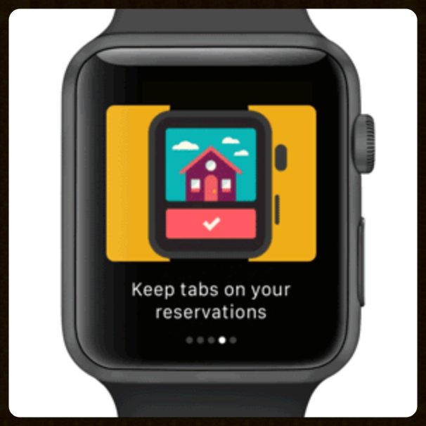
The future is now, well at least we have a glimpse.  Between writing and posting this blog, AirBnB announced their Apple Watch App which could act like the Message Center I defined above.  Good to see we’re on the same page.   This could be a good start, but if it’s not situationally aware and focused on core use cases, it’ll be a miss.

BOTTOM LINE

The AirBnB app is clean, snappy, and well designed.  But if AirBnB is is going to overcome recent backlash it should address Trust, Safety, and Regulations and be a link between hosts and their guests.   With well appointed additions, the app could be a Message Center for specific alerts and timely checklist reminders while supporting features to address Trust and Safety.  Otherwise, the PR nightmares will continue to mount, which would burst their bubble.            

NEXT TIME

It’s no secret AirBnB wants to go from managing one part of travel, the room, to the entire experience.  Next time, we’ll take a closer look at how adding basic hospitality services can help AirBnB go beyond the room and hold the customers they grab.  As well as digging into app features which can help with Regulations.  Oh, and maybe take a closer look at the Apple Watch App. 

Meerkat v. Periscope, Next Episode

Whoa!  that was fast, just a week after my June 30th blog, Meerkat rolls a major update, addressing key areas that were begging for improvement.  

Their V1.5 release is ambitious and demonstrates: 

  1. they get it (or at least they read this blog, haha) and
  2. they have a strong ability execute   

Let’s walk through it; then compare to the July 8 release from Periscope. 

CAMEO

cameo

As the name suggests, enables the broadcaster add a viewer for a brief appearance in their livestream.  Simply tap on a viewer’s icon from the audience and invite them to cameo.  

  • Cameo meerkaters must be invited by and accept the broadcaster's invitation 
  • Cameos are one at a time
  • Cameo streams display nested inside the host’s livestream 
  • Cameo streams last 60 seconds

This is awesome! a creative way to improve Engagement  and even better than my suggestion: allow livestream viewers to leave voice memos (like “love line” call in shows) but why stop there? it’s all about live and video, duh!  

Well played.

FACEBOOK CONNECTION

Connect your Meerkat account to Facebook to “magically” Discover friends and interests.  It’s about time (easy for me to say).  But this had to happen, my #1, NOT-SO-BOLD-PREDICTION from last week.  Time to move on from the Twitter episode; I have 1.44 Billion reasons why.

NO SOCIAL MEDIA, NO PROBLEM!

For those out there without a Twitter or Facebook account… wait... do you even read blogs? was this printed and mailed to you? anyway, now Meerkat accounts can be created with just a phone number, welcome!

MEERKAT LIBRARY 

Livestream videos live on; now Meerkat will host your finished streams so you and others can watch them later.  This is close to my suggestion of a more seamless connection to YouTube, letting Google store the ended streams; perhaps Meerkat learned their lesson from another company, eh hem, tweet, tweet. 

SHARE BEYOND TWITTER

Sharing is seminal for growth and Meerkat now allows notifications of upcoming streams to be shared out to Instagram, Facebook, and Tumblr.  

SEARCH

Meerkat now has search!  previously there was a sad text box masquerading as search; not anymore.  Meerkat. Now. Has. Search.  This is a good start for the Discover use case, but limited to finding friends; still plenty of opportunity for improvement here.  

LEADER BOARD UPDATE

Now there’s both “Past Week” and “All Time” leaders *yawn* but more importantly for Discovery the “Suggested” list helps you find people to follow based on your connections; and thus Meerkat Social Graph begins.

AND IN OTHER NEWS…

Periscope released 1.1.2 with the following, it’s not fair to compare, but let’s do it anyway:

  • Profile edits of name, photo, and description
  • Blocked comments displayed as such (to the broadcaster)
  • Polished the design of “Featured Users” and Broadcast Share” sections

THE BOTTOM LINE

Meerkat won this round.  V1.5 shows great promise, as the team focuses on Discover, Engagement, and Share use case to enhance their ability for grabbing and holding users, well after the initial novelty wears off.  Periscope unfortunately, dropped a point release on the same day; was this a true comparison?  No.  But will the ongoing Twitter management drama weigh down their ability to execute?  because, the ‘kat moves fast and they’ll have to sprint hard to keep up.   

Amazon’s Other Showrooming App

With Amazon Flow, featuring visual search, the world is your showroom, but does it work well as a stand-alone app?

My wife and I bought a house last year and are saving to start a family; so in 2015, it’s less frivolous spending and no impulse buying.

Four months into 2015 and my resolution to be more discerning shopper was relatively still intact.     

That is, before I rediscovered Amazon Flow, which essentially has a “point and impulsive buy” button for everything around me.  Great plans to spend less: blown. up.   

It started with a simple price-check from my pantry; it couldn’t hurt to look, right?:

Coconut Oil:

  • Point the App,
  • 1-Click Buy,
  • Arrives in two days.   

Whoa! way too easy.  A quick lap around my kitchen, pointing the Flow at whatever seemed low: sea salt, cumin seed, green tea, coconut water, almonds: Point the App, 1-Click Buy, 1-Click Buy, 1-Click Buy… viola! our kitchen pantry was transformed into a virtual grocery store and in two days, prime, it would be replenished, thanks to Flow.

THE GOOD.

Amazon is the largest online retailer in the world; their core competency has always been frictionless shopping and Flow follows this arc: 1-click “buy now;” Amazon Prime; subscriptions all orchestrated to quell the tiny voice “do I really need this?” 1-click, boom! too late, arrives in two days.

Twinkling blue stars mean it's working

Twinkling blue stars mean it's working

It Twinkles!

Flow is a barcode reader without the barcodes.  With the camera lens in your phone, Flow uses image recognition to find products; which can be added to your Amazon cart.  You’ll know it’s working when the twinkling blue stars hone in on the product, then add it to your running list; all within seconds.  

Killer App

With Flow, Amazon didn’t just port their website over to an app; they reimagined their core offering as if it were something new; addressing the must have user experience in a smaller screen while concentrating on first class use cases around the native camera for image recognition and search.  Flow is focused, stripped down to the essentials.  Flow is for Hunters, and not Gatherers.  Buyers, not Shoppers.  When we just want to place an order and move on.  

Layout

Released the same year as Snapchat, Flow has a similar camera-as-homescreen, stripped down user interface which gets out of the way of making a purchase.  Every overt interface element is thoughtfully placed to optimize purchase or dismissed to the pulldown list on the righthand side, a.k.a the “gutter.”   

History

If you don’t “buy now,” there’s History, which is an editable list of your previous visual searches.  This is helpful for accessing previously detected products, when they’re no longer in view.  Or, to haunt you until you buy them.  

OPPORTUNITY FOR IMPROVEMENT

I like Flow; I prefer it to the Amazon App, it’s stripped down, un-bloated, devoid of nonessentials.  However, it’s been around since 2011 and hasn’t exactly caught fire.  Last year Flow’s image matching tech was added to the Amazon app so good luck guessing Amazon’s next move.  

In the meantime, I prefer the streamlined version, because I’m a hunter, I know what I want; am in and out, done.  Which is it for you; full version in all its browsing glory or stripped to essentials in Flow?  share your thoughts in the comments.  

Amazon should focus on judiciously added a few features to Flow; but overall keep it lean and clean.  

“Out Of The Box” Detection

Flow should be able to detect products, literally, out of the box.  Image recognition tech is improving, by the quarter, and Flow should keep up with this pace.  To illustrate, take these Ted Baker boots.

I bought them on Amazon and they’re still available, but Flow had no recognition of them.  


I’ve worked with image recognition tech that could match these two images, quickly, with a high degree of accuracy.  So come on Amazon, let’s step it up here.  In fact I should be able to snap a pic with flow and run an image search for similar products - after all Amazon practically invented the collaborative filter (product suggestions based on similarities).    

It would be cool to snap a stealthy pic of, say someone wearing a great jacket across the street, and instantly pull it up with close matches, ready for the Amazon cart.

Buy It Again

What’s keeping Flow from standing on it’s own?  Quite simply, my “go to” list of purchases.  And while the image detection tech is being improved, voice search would be helpful.  But that’s it.  Adding these two features will bring balance to the app; between excess and essential features.  Here’s an enhanced layout, elevating Flow to stand alone.

The enhanced interface moves the text search to the top middle and pulls history out of the gutter onto the left side; with voice search accessible from the pulldown list (which of course is hidden when not in use).  


The History icon opens the same list views but includes an “Orders” view containing all previously purchased items, so I can easily reorder - especially when items are out of sight.  This Order history should pull from my full Amazon purchase history - amazon.com as well.

THE FUTURE

The hybrid, physical storefront with ecommerce fulfillment, has been a “next year” thing for  over 15 years.  With its Flow technology, Amazon skips ahead to fast fulfillment of the world around us; even using the storefronts of others to order their fulfillment.  Sure we can obsess over usability, performance, and design details; but let’s be clear:  It’s an app that will frigg’n take a photo of a product then have it to you in 24 hrs; the future is now.   

THE BOTTOM LINE

Amazon has a good first version product with Flow, but since its 2011 release, they haven’t exactly set the industry ablaze with new features.  Amazon should add some basic features to breakout Flow as truly stand-alone for all ordering use cases; as it has the potential to be better than their “full version” mobile app.  Until then, the hybrid storefront with ecommerce fulfillment is still a year away, for yet another year.